Thursday, December 17, 2015

From Beginner to Proffessional: Final Project

My website will be used to promote myself by including all of the work I have done throughout the 
semester.  The work I have completed such as the resume, flyer, poster, postcard, brochure, logo, and business card, were uploaded to the portfolio page on the website. These projects relect on how I have grown as a student and communications skills. I never would have throught I could create graphic designs in programs such as InDesign, Illustrator, and photoshop as well as create a website in Dreamweaver. It was a challenge but I worked hard and proud of the work I have completed by the end of the semester. The social media projects tie in with the website I have created in that the website represents myself and the work I have done. The portfolio page shows all of the hard work I put in to this semester as well as my creativity. The resume shows that I have excellent and varied work experience and it’s fun! The flyer shows that I have the ability to attract someone to come to an event with fun subheads. The poster shows that I can create a message to readers in a unique way. The postcard in a representation of who I am as a person and how others see me as a person. The brochure really shows how hard I worked on that assignment. It was challenging because my group chose a hard brochure layout, but made it work. With tons of revisions to the brochure, it turned out just as I 
expected. The logo and business card were created for a catering business. I have always had a dream of starting my own catering business. The logo I chose to create is fun and eye catching. You know instantly by looking at the logo that it represents a catering business. The work that I have created is successfully posted to the portfolio page of the website I have created, which was another accomplishment in its own. Creating the website was not as hard as I thought it would be. It sounds more scary than it actually is. I have never used Dreamweaver before or any other website software, so completing the website in two classes was accomplishing. The coding was a bit intimidating but my teacher was just oh so helpful that she made it easy to complete! I had all of my files as pdf’s as well as jpeg’s along with all the images and original files in the correct folders, so the website seemed like a breeze in a way. I am happy with the way the website turned out. Being organized pays off! I did have some troubled with trying to figure out what to remove to the coding to remove something because I felt that if I removed something that needed to stay, I wouldn’t know how to fix it. It was only a bit stressful, but I made it through alive. I am very happy with the work that I have completed this semester. It was also an extremely fun class and Maria Pabico is the best teacher ever! 

Tuesday, December 1, 2015

Five Crafty Logos

5 Logos: 

This Starbucks logo is a picture of the coffee queen in the center and Starbucks Coffee around the edges of the logo. The colors used green and black work well because they are earth tone colors.

This Target logo is perfect. The name of the store is Target and it’s a picture of a target with the color red which is the color used for the store name.

This apple logo is internationally recognized. It is significant in representing its products because it is such a simple icon of an apple but it just works because the brand is Apple. If you see this apple icon you automatically know it's an Apple product.


This check mark logo represents the Nike brand very well. I always saw this logo as a check off of a to-do-list. The slogan for the Nike brand “just do it” goes hand in hand with this logo

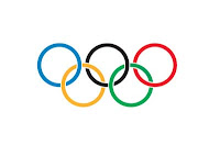
This logo representing the Olympics is very well done as well. The five  different colored circles represent the five different areas of the world that participate in the Olympic games (North and South America are considered one area, along with Africa, Australia, Asia and Europe) They are shown linked together to create a sense of unison. 

My Logo:

My logo is going to represent my future catering business. It has always been a dream of mine to start my own catering business so this logo will represent a classic,creative, fine cuisine business.The logo is going to be creative and stand out to catch attention and interest. Everyone is going to want to book me for their next event. 

Monday, November 16, 2015

Good Design Meets Brochure Pamphlet


   3D Corporate Brochure Ravi:


This brochure design is very successful because it is very eye catching. This brochure would likely to be picked up seen from across the room. It is not crowded or overwhelming, but just the perfect amount of minimalism. The color usage is done very well with again minimal usage. Two colors, grey and red are used here. With very small use of the color red used with an all grey background helps the logo to stand out at the bottom front left corner of the page. The information at the bottom is important to the brochure so the red is a great touch that draws your eye straight to it. Variations of the color grey are used within the 3D design which helps to create the texture in this piece. Repetition is used with the lines on the front and back of the brochure. The lines and color variations give the appearance of a hard wood floor. The 3D effects used in the brochure are nicely done which also helps create texture. Since the brochure is a corporate, professional brochure, the text used fits well. The text is not overdone or in your face. It is readable and varies in size. The font matches the layout that creates a perfect relationship within the brochure. The text is straight to the point and represents the company in minimal word usage. There is just enough text for the cover of a brochure. The most important information is the largest and least important the smallest. The layout is a very clean, well designed look. There is visual hierarchy shown here with the 3D design centered and the text and logo at the bottom. It is balanced and very pleasing to the eye. Effects are used here but it is not overdone. It is minimal but there is texture and effects that give a wow factor to the brochure. Sometimes less is more.

    Green Tri-fold Brochure:

The design used in this tri-fold brochure is beautiful. The lime green light on the cover draws attention. It looks like glow in the dark blowing glass. The designs used in the brochure effectively portrays the information that the brochure is about. The information about providing green solutions is displayed by using different variations of green throughout the brochure with dark and very bright glow in the dark looking colors. It attracts attention and is very nicely done. Green is the only color used except the white and black. The information is all about green solutions so the color is a very good representation of what the brochure is about. Repetition is used on the inside of the brochure with repeating designs such as the electrical outlets to bullet information as opposed to using plain bullet points. This really stood out and a very creative touch. The subheads are a glow in the dark color green which separates the information well and gives the reader a clear overview of what they are reading. It is well organized. Repetition is also used at the bottom of the pages. The white designs that almost look like some sort of spark reaction or current from the electrical outlet. The designs work nicely together with the text and color. There seems to be a lot of text inside the brochure, but it is well organized. There is an overview, bullet information, and some more information on the right side panel. The text is separated with different colored backgrounds such as the black in the middle. The font used is professional and fits with the type of information that is displayed in the brochure. There is a lot of information so the font is small. It could be a bit bigger but then all the information probably would not fit. There is a good balance between text and graphics which is pleasing to the eye. Overall the layout is done very well. The cover stands out and the inside has some very creative touches with the design and graphics. There is visual hierarchy with the subheads, to the bullet points, to the graphics along the bottom overlapping all three pages. Good design is clearly presented here.

Tuesday, October 27, 2015

My Reflection: A Postcard About me, from me, TO YOU!


My experience in creating this postcard was a bit challenging, but that’s the point! Assignments involve overcoming obstacles and learning. I had fun creating the postcard. I feel proud about the outcome. Using all three programs (Illustrator, InDesign, and Photoshop) was tough, but it was a great experience in developing my skills. I feel as though working on this assignment in class with assistance from my very talented professor Maria, really helped to make certain problems I have been having with these programs stick in my brain. Taking detailed notes of step-by-step instructions has done wonders in helping me improve upon this assignment. Silhouetting pictures in Photoshop and removing the background, creating graphics in Illustrator and placing them into InDesign, and using a text wrap without any problems interfering have all been problems I have when using these programs. These are all problems that I have successfully overcome!

This assignment is essential in design communication. As a designer, you must be able to fluently create a project using all three programs. With constant usage of Photoshop, Illustrator, and InDesign over time becomes natural and less stressful to say the least. When working with a client and they give you a project they want you to complete for them, you need to be able to design whatever it is and design it well. It should exceed all of their expectations to a T with no error. Being fluent in using all three programs is needed to create a perfectly assembled design.

With this postcard, dark colors were used in the background, using burgundy and black hearts to match the shirt in the picture. The text was placed over a lighter version of the background color which was a pinkish color. This was done to help the text stand out and easier to read. Burgundy was used to create a sense of what my personality is like. In the picture, I am wearing a burgundy sweater, which is a color I like to wear often. My car is even burgundy! I like darker color swatches and using lighter variations of colors to create contrast. This helps the colors to “match” just as if I was wearing those colors in my outfit. The picture was edited to create a watercolor effect to cover up a semi-blurry picture. It turns out that I liked the picture more that way and became intentional to create the image I wanted.

The font that was used for the title is a bold Algerian which draws the eye straight to it. The letters are thick and match the hearts on the right. “A Day in the Life of Stephanie Amaro,” is a bold introduction. The bold introduction combined with a light and artistic flowy font (Monotype Corsiva) for the text description works well in contrast with each other. It gives a little bit of variation, but is not overwhelming or too much on the eye.

The design hierarchy that was used in this postcard works perfectly with the use of balance, contrast, and space. The picture that was used and the way it was silhouetted had to be placed on the left side of the postcard. It was only natural for the text to be wrapped around the right side of the picture. The hearts that fall from top to bottom of the right side of the text helps to fill blank space and decorate the words. The hearts also help to display the part in the text that explains my personality that mentions my likability and being able to make friends wherever I go. The title of the postcard “A Day in the Life of Stephanie Amaro,” was placed at the very top and centered to create a starting point to the text and a starting point to the design hierarchy. The space is all filled up but not cluttered. The text and graphics are evenly spaced out with room to breathe.

The assignment requiring the use of all three programs was essential. Each program has its strengths and weaknesses and when all strengths are combined, a beautiful design emerges as a result. These programs are challenging to use and master. Certain tasks cause problems sometimes in these programs and being able to be patient and figure out a way around the problem, is a rewarding feeling. Text wrap always seems to give me problems, but with help from professor Maria, that text was going to wrap around that picture one way or another. By using the pen tool, we were able to make an outline of where I wanted the text to wrap around the picture. The pen tool is often used in Photoshop to silhouette pictures and I learned a new way to use that tool in InDesign, which I did not even know was possible.  Overcoming these obstacles allowed me create a beautifully, well-designed in hierarchy, and pleasing to the eye postcard.

Thursday, October 8, 2015

Identify yourself through Fashion

Fashion and Identity

1. The idea that fashion has moved from simply a necessity for survival, to a way to identity and expresses yourself. Fashion has evolved over the years and gone through different “trends” in society. History of fashion is in other words history of humans. Over the years, there has been a huge change and modification in fashion that match the changing generations. Cultural, political and economic changes have influenced the evolution of fashion. Certain fashion styles and designers are influenced by fashion from the past such as the 80’s fashion.  High fashion designer Marc Jacobs recently held a fashion show called “uber-80’s.” Certain fashion statements from the 80’s are present in today’s fashion such as shoulder pads for example. Fashion can be a way to express how you are feeling a certain day. You don’t have to be interested in just one style but can wear all black one day and be colorful the next. Being creative with how you dress can be fun so why not utilize it! Being fashionable does not need to be expensive either. Going to the thrift store and finding clothes can be an inexpensive way to be creative.

2. Fashion is a combination of social and economical issues that go hand in hand. Fashion is social in the sense that many people are judged by what they chose to wear. People get bullied for the way they are dressed if it does not fit the “norm.” The issue gets battled every day, whether it is at school, work, or harassment from people you don’t even know. Women get judged for being “too revealing” or get called names such as “slut” because of their choice of dress. Fashion as identity is also economical because clothing costs money. Some clothing, depending on where it is purchased, can be extremely high priced. Thrift stores are the most affordable option and in my opinion, most creative. Socially, someone can get bullied for not having enough money to go buy what is “in style” and economically not doing so well and unable to fit clothes shopping into their budget. There is a lot of pressure to be in style by the media and people around you. It is hard to stay who you are and be individuals with pressure from society. Depending on different jobs you apply for, if you are dressed well, you have a better chance of getting hired and opportunity to make more money based upon looks and how you present yourself.


3. I am in favor of this topic and agree that fashion is a great way to identify yourself and be creative. Fashion can bring out a whole different side of yourself that you never knew existed. Fashion is constantly changing and it is up to you to either take what is “in style” and make it your own or make up your own fashion statement. This is a great way to express yourself and if you present yourself well enough, it could benefit you more than you think. Like I said above, it could help you get a job and become more economically stable just by presenting yourself the right way. I found these links funny because this topic actually gets written about in magazines so that teens will see it.

4. For this topic, I would use images and designs that express different fashion styles. I do not mean this in a way where I am simply just going to post pictures of outfits and trends and call it a day. I am going to use fun designs that pop out on the page to draw attention. Then I am going to possibly display some trends such as a picture or just the word of something trending such as shoulder pads. I may also list bullet points somewhere on the poster that shows the benefits of fashion like I mentioned above such as landing a job or feeling better about yourself. I am going to look at trends and get ideas. These two pages are where I have found some ideas so far:
Maybe have a runway with words and fashion trend words such as “fashionista” “Celebrate your inner creativity” “Present your identity to the world in a fun way”

5. Ten adjectives that describe fashion are:
·        Fun
·        Creative
·        Individualized
·        Expressive
·        Representative
·        Beautiful
·        Artistic
·        Self-Revealing
·        Personalized
·        Identifiable

6. I would use fonts that look fashionable or fonts that look like they would be used in a fashion magazine such as Broadway or Brush Script MT. Bodoni is another good font used frequently in fashion magazines. I think these two fonts would best represent what I am trying to convey with the poster.


7. The theme of this topic is definitely a fun, creative, and optimistic/positive topic. This topic is all about being expressive with how we dress ourselves with the good things that come from it. The color palette that I would chose would be burgundy and teal or more vibrant colors that stand out such a yellow and coral types of colors.


Saturday, October 3, 2015

Critiqued Design at its Finest

A+ in Design Hierarchy

This anonymous poster is very pleasing to the eye. Some people are not aware of who or what anonymous is and this poster would intrigue an individual to want to know more. The poster is visually designed well based on the design hierarchy. The poster makes you look from left to right being that anonymous is blown up on the page but off the left going off the poster even. The words on the right make you look from the bottom right up to the top right which makes the eye wander the poster, making it exciting. The font is also a good choice, giving off a serious vibe. The colors black and red help the poster stand out and also contribute to the serious vibe. The use of only two colors is nicely done, and was not overdone. Black and red create enough emotion in this poster and no further colors are needed. The facial expression of anonymous is genius. The smirk and raised brow give off the impression that something is quirky about the idea behind this poster. It helps the reader to want to know more about this “freedom forever” poster. I would like to know what vendetta this guy has out for society.


This movie poster that is advertising “The Dark Knight Rises” is very well designed. The way all the tiny bats are a part of batman’s cape and disperse at the bottom is clever. The two colors that are used yellow and a light red were good choices. They help the black batman stand out. The placement of batman being in front of the yellow moon draws the eye straight to the center which is a good focal point. His placement and the way the bats are flying away in the night in front of the moon is an intelligent way to represent the movie title. Batman is “rising” into the dark night. The small print at the bottom listing the actors involved in the movie should be at the bottom where they are. The main focus is batman, who is centered where he should be. The hierarchy of design is perfect here in this poster. The font used is bold and stands out. It gives off a dark and mysterious vibe. This poster is very well constructed. The image is large and centered where all the focus goes. Batman is large enough to bring attention to the poster but not overly big to where there is plenty of room in the margins.


This poster is a combination of well-designed graphics and a strong statement. “People ignore design that ignores people.” This poster pretty much says, “Hey look at this poster because now that you are reading it, I caught your attention, making this poster graphically intriguing.” If you didn't notice the poster and simply walked by it that would mean it was ignored/overlooked.  The use of the eyeball being in the poster really represents the statement perfectly. Your eyes are being drawn to the eyeball. The use of two colors, blue and gray, is not too much but just right. The blue on top of the white, black, and gray (all neutral colors) really helps it to stand out. The middle finger is also eye-drawing. From afar, if people did not know what the statement read, the eyeball and middle finger would attract enough attention to be looked at. A good design attracts the eye, which is exactly what was done here. When searching for posters, this one really stood out to me. Ironically, the statement fit perfect for what the assignment was. The font is pretty basic and small, but most likely done on purpose. The poster is about the graphics. The statement at the bottom is meant to be smaller than the graphics.


This poster caught my eye immediately, especially after a discussion that our class had on the first day of class. This perfectly designed symbol was stolen and turned into the most well-known symbols for the worst reasons. The poster displays that the direction of this geometrically perfected design, makes a huge difference. The poster portrays a very important topic about a miserable time in history when Jews were slaughtered. The message is strong and visually portrayed well by making a very distinguished difference in the way the symbol was changed. By making the two different versions a different color and on opposite sides of the arrow perfectly spaced apart, it visually displays what is said on the poster. “Direction is important,” stands out underneath the symbols because it is written in white over a brown background. The poster uses minimal color and very simple, but works in its favor. The poster utilizes its space well with a perfect balance of “white space” and graphics. There is room for more, but less it better in this poster. It is not cluttered which helps the eyes to draw attention to the center which then directs the eye left and right, then down putting two and two together.


This poster advertising a play is assumed to attract the ladies more so the men (not saying the men won’t be dragged along by the women to attend). The huge bomb with the lipstick kiss is the focal point of the poster. It takes up most of the space. The text on the right side of the poster is a little bit too crammed to the edge of the margin, but it works. The way the text is in different directions makes the poster dynamic. “Venomous” is a big, bold font and spaced out to match the size of the bomb, which is pleasing to the eye and displays in writing what the play is going to be about. The information about the play is displayed in a normal sized font that reads normal from left to the right so the reader can easily access the information. That font is different sizes which makes it fun to read. The use of only two colors, pink and yellow, helps the poster to stand out and not lose the main focus which is the bomb. The play is assumed to be a fun, mysterious, drama by looking at the poster. A bomb is about to go off and it is kissed by a woman, which makes me wonder who wouldn't want to go see this play?

Award for Worst Designed Poster goes to....

This poster advertising the play “Annie” is poorly designed in my eyes. The font in the center which provides information about the play is very small, plain, boring, and just plopped in the center. There is no creative way to display the information and it is not visually pleasing. The information is most likely not even read by many who read it. There are also no graphics that describe what the play is about. There are music notes at the top but they just let the reader know the play is a musical. The date of the play is just thrown at the bottom is very small font. That information is kind of important and there is so much white empty space in-between the body of text and the date of the play. The font should be made bigger to eliminate some of that empty white space. The body of text could be made bigger as well. It is straining to the eye to try and read what it said. The use of different fonts at the top is a nice touch, but the rest of the poster does not make good use of all the fonts there re to choose from.


This poster is hard to make out what it is even advertising. The white font is so hard to read and can barely make out what it being said. The background of the poster was a bad choice. The name of the play “Bad Brains,” could have been represented with a picture of a brain and not a blown up design of what looks like could be a brain. The words are easily lost with this design. The colors chosen do not helps the words to stand out. The logo that is at the bottom left hand corner of the poster is lost and barely visible. The poster screams “too busy.” The font used for “bad brains” is a fun font, but could have been made a bit bigger. The poster makes the reader lost and confused. The space could have been utilized better by making words bigger so they are easier to read. The background consists of dark colors, so the least that could be done is making the words bigger so that they are somewhat visible. There are too many colors used. I cannot tell whether it is the design used that makes everything unreadable, or the dark colors in the design. The brainy looking background could have been a light brown or some other light color so that the words are visible.


This poster is a little bit too busy. There are too many fonts and sizes that make the reader lost. There is no design hierarchy of design here at all. The information and statistics could have been presented better by using some sort of graphic to give the poster some dynamic. The logo at the bottom right of the poster is so small, it is almost invisible. The number of fonts should have been limited to two, not four or five. The statistic is scattered but was attempted to keep some order of direction with the use of arrows. The arrows help somewhere, but at first glance your eyes do not really know what direction to go in next. The statistic is supposed to help motivate men to make sure to see their urologist to prevent prostate cancer. If the poster doesn't even get read because people can’t easily read it but have to figure out the direction of the sentence first, the purpose is diminished. If the statistic was made smaller and condense the use of fonts used, maybe two eye opening statistics could be on the poster. The poster is supposed to make a strong impact on men who read it, but it does not look like it will get read by many.


Tuesday, September 1, 2015

The Dissection of Visual Communication

I respond best to visual communication. I feel that because I avoid confrontation at all costs, that when communicating with others, short and simple works best with me. If I get into a conversation that starts to get confrontational, using an image to express what I am trying to say often works much better with me.
With the use of symbols and images, people are often able to get their message across to others in a direct way. Sometimes people have trouble expressing what they are trying to say especially when it is a conversation or topic that may not be so easily expressed in words. Some are better at communicating with words and others with visuals. These visuals can include text as well.
I have found that on social media websites such as Facebook and Instagram, people post Memes which are often humorous images with text and images that spread on the internet to get a certain point or idea across to others. Instead of arguing about a topic such as police brutality for example, which has been in the midst of many debates around the world, posting a Meme or image with text involved, could cause a much better reaction and may even change someone’s opinion. Visuals can speak louder than spoken words.
 Instagram is a company that is all about visual communication. Users communicate with others by uploading and sharing videos and pictures that express views, opinions, thoughts, emotions/feelings, etc. Visuals are what drive this website and make it different from other social media websites.
The Nike brand is also huge on visual communication. The check mark symbol is used to represent the Nike brand which is connected to their slogan "Just do it." The brand and slogan appeals to athletes and everyone around the world because this symbol and slogan is tied directly to the Nike brand that is so widely advertised. This symbol is so visually appealing because the check mark is used to represent checking something off a to-do-list for example and the slogan "just do it" is a motivational tactic. This motivation is tied directly to athletes because the Nike brand sells mostly athletic wear.
McDonalds is another company that uses symbolic means to attract customers to their business. The big "M" is so widely recognized around the world. People could see this symbol on a sign driving by on the highway or from miles away in the distance and instantly recognize that McDonalds is near. The colors that are used to advertise McDonalds are mainly yellow and red. Mustard and ketchup are used as condiments. By using these visual colors, consumers don’t even realize that this technique causes their brain to crave McDonalds.

There's a method behind the madness that is advertising. Whether visually or spoken communication, the method is designed to draw you in as consumers to buy or use a product. By becoming educated on how this is done, the more control you start to have over others minds.